Empressa
Brand identity
Selected work / 07 projects
All projects


01 / Brand identity
Empressa
Empressa
Identity mark
The focus
The approach
- Role
- Designer
- Project scope
The identity
An interlocking emblem with a gold-to-copper gradient. Explore the original mark and its sculpted paper silhouette.
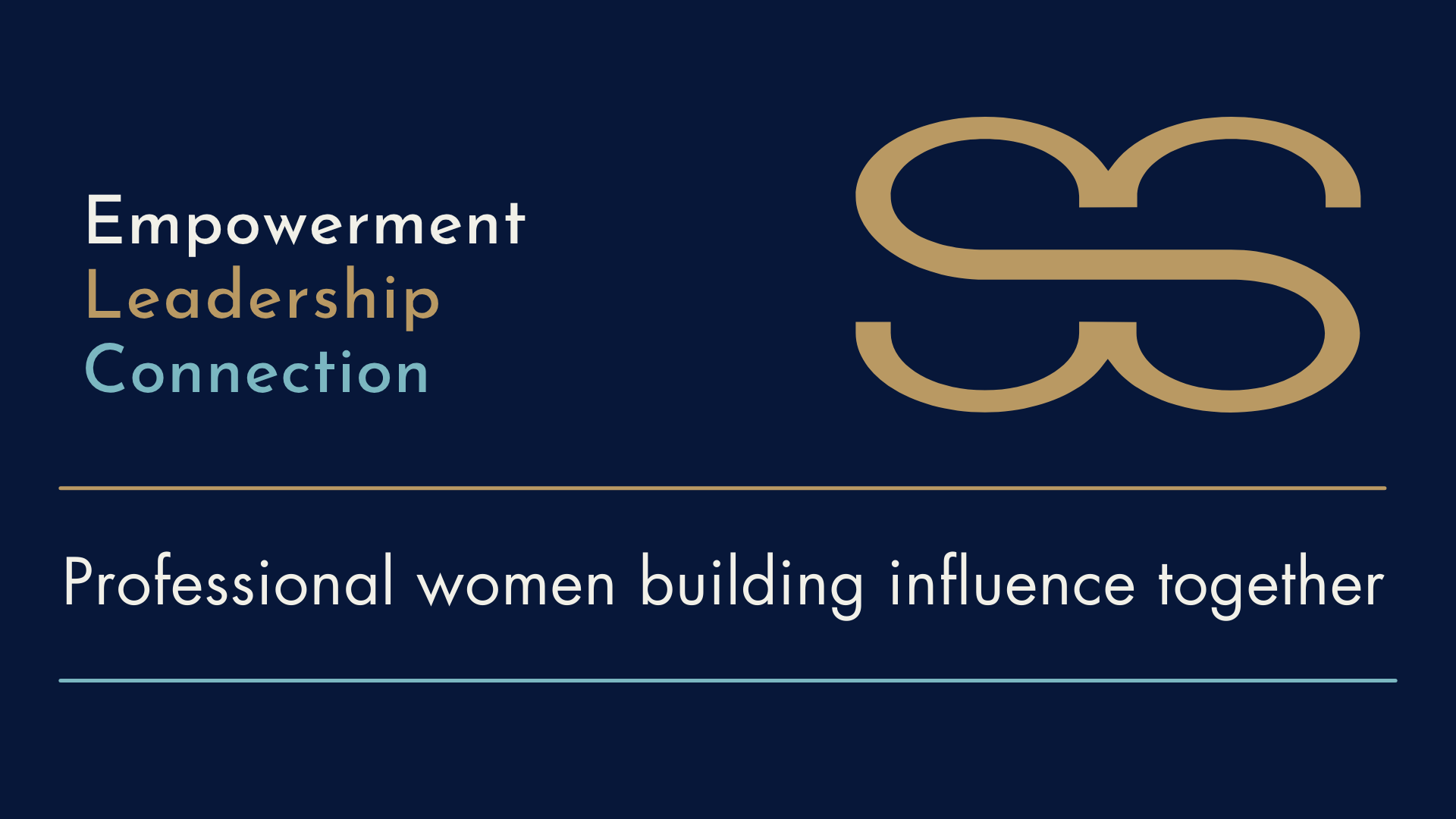
Shared ambition
Empowerment, leadership, and connection. Professional women building influence together.
View full size ↗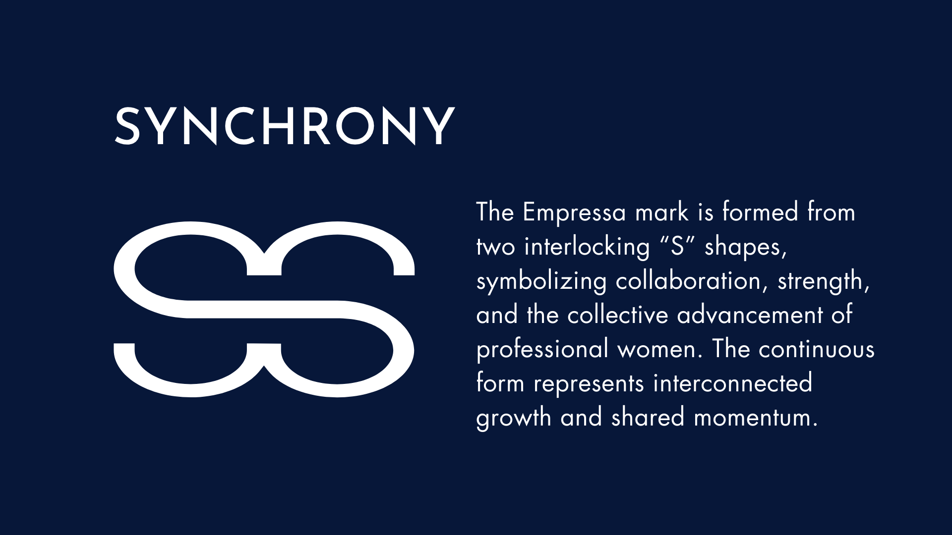
Synchrony
Two interlocking “S” shapes form a continuous symbol of collaboration, strength, and shared momentum.
View full size ↗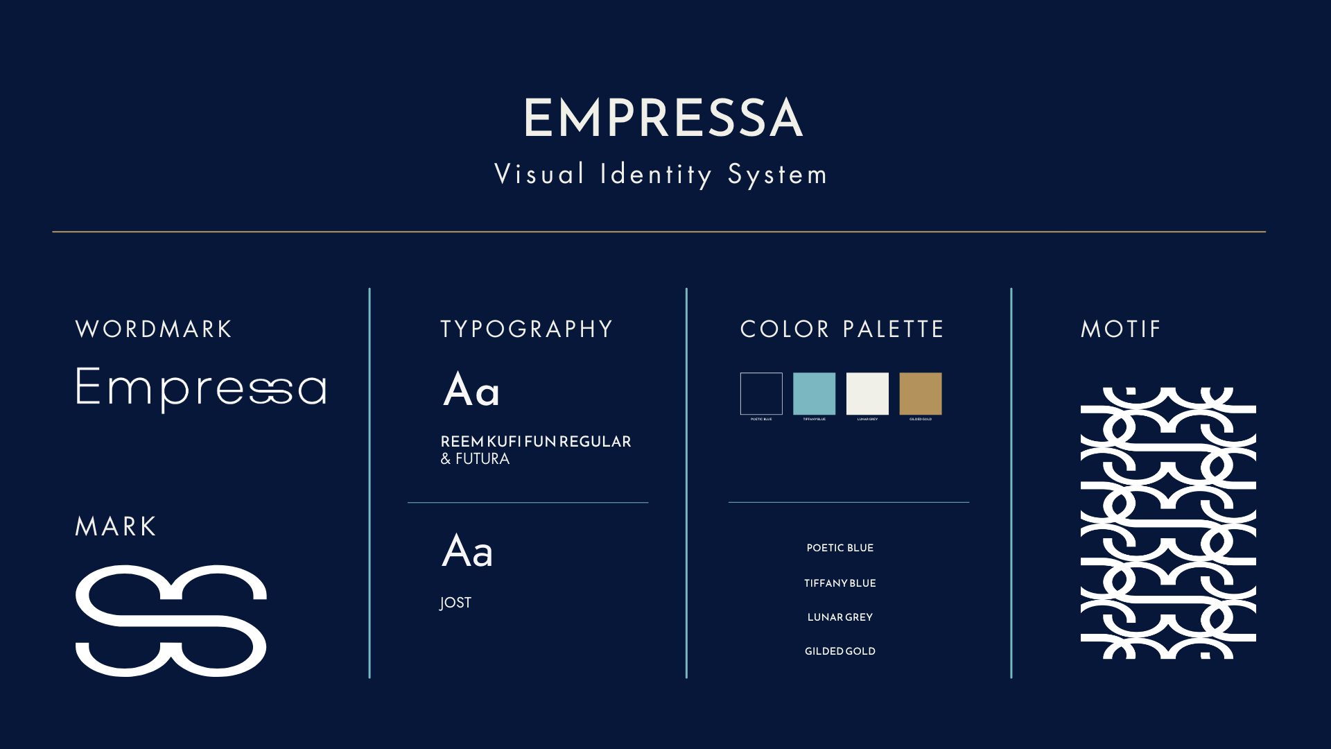
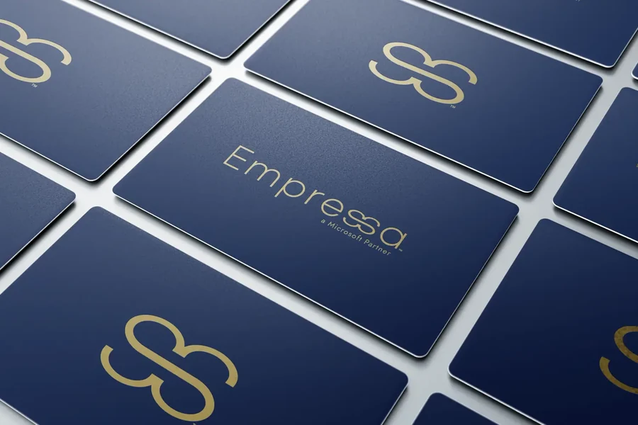
A connected visual system
The wordmark, typography, palette, and repeating motif bring the identity together.
View full size ↗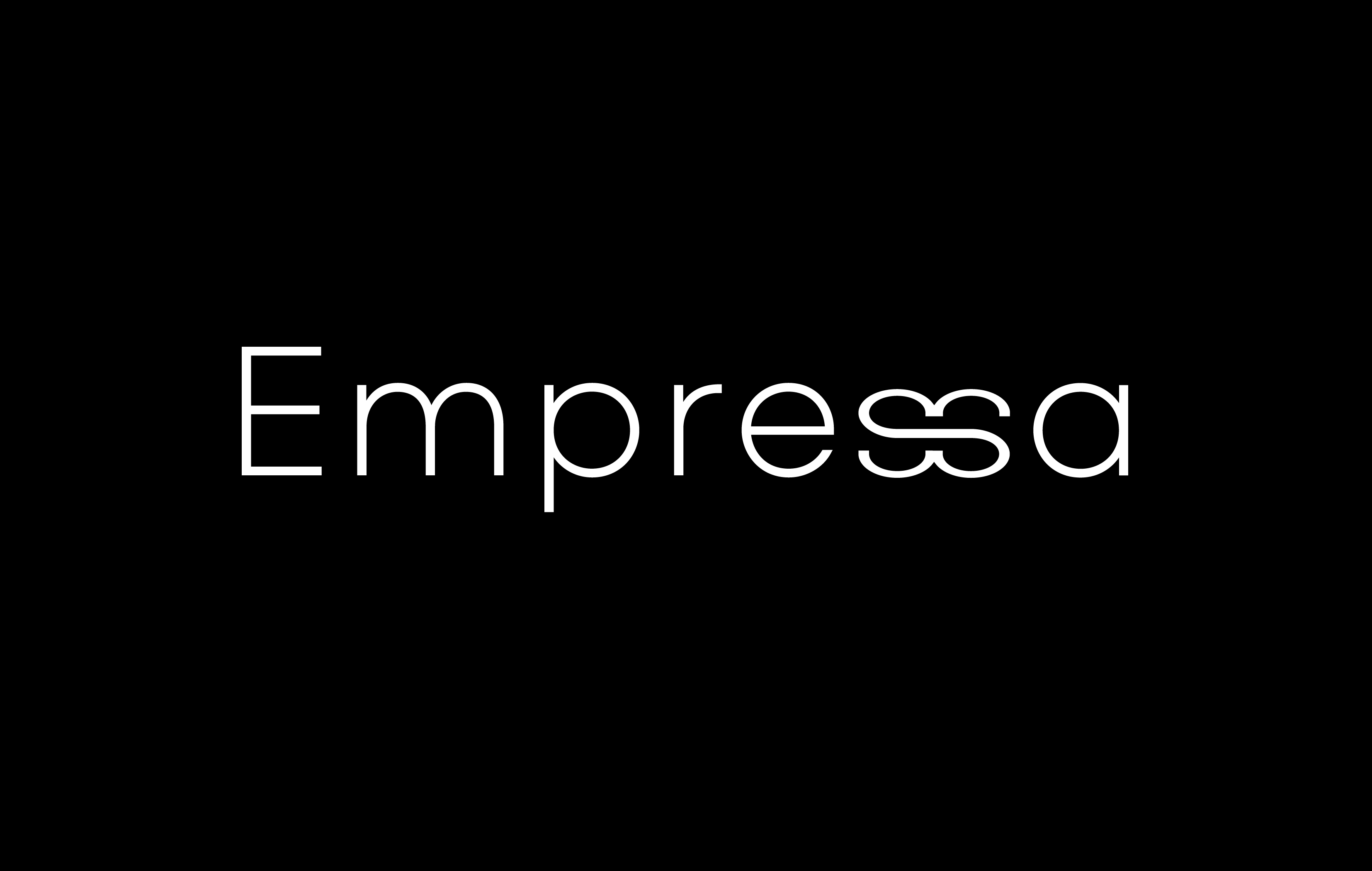
The wordmark
The interlocking form becomes part of the name.
View full size ↗
The mark in motion
A dimensional study of the continuous form.
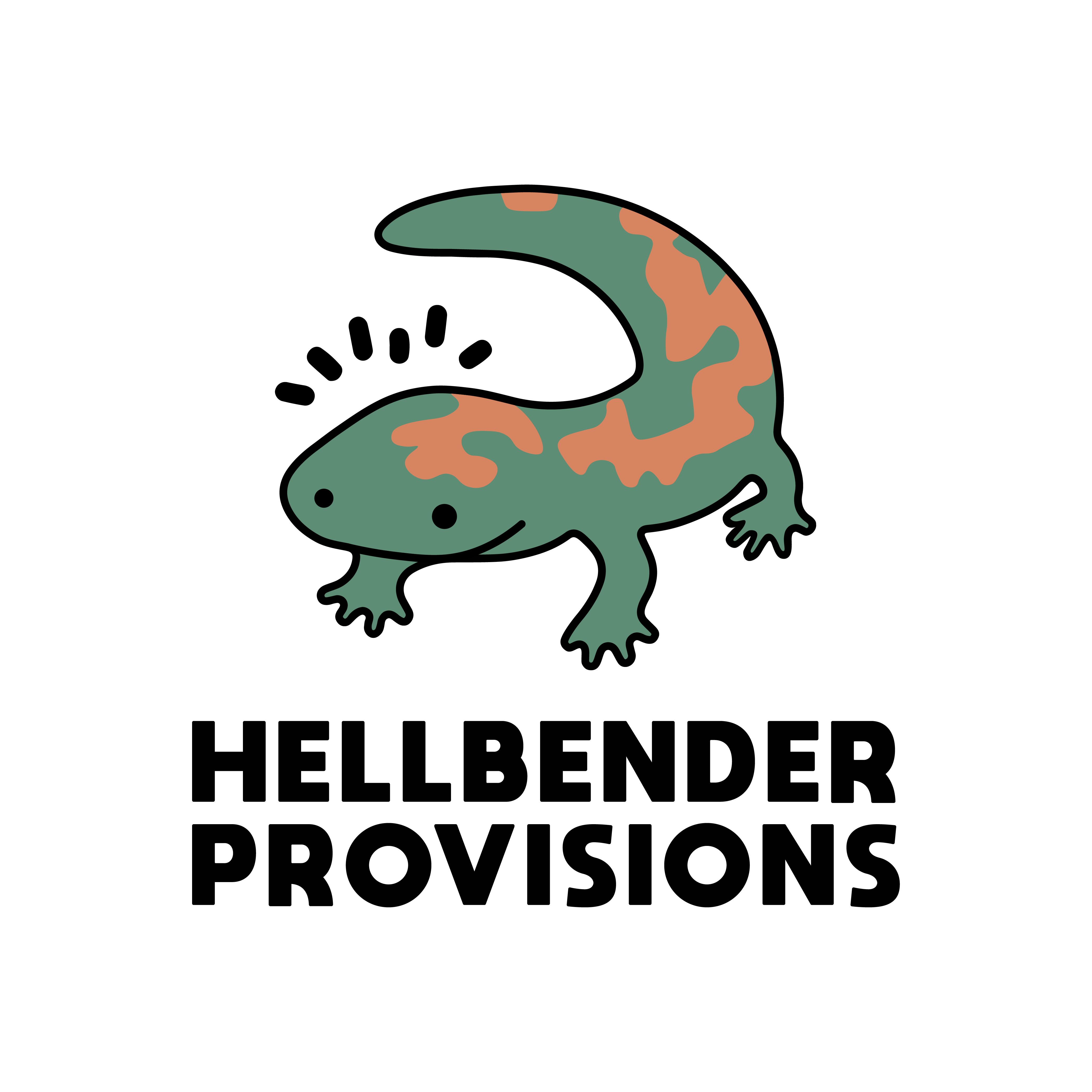
A character-led identity
The salamander pairs an earthy green and terracotta palette with a bold stacked wordmark.
View full size ↗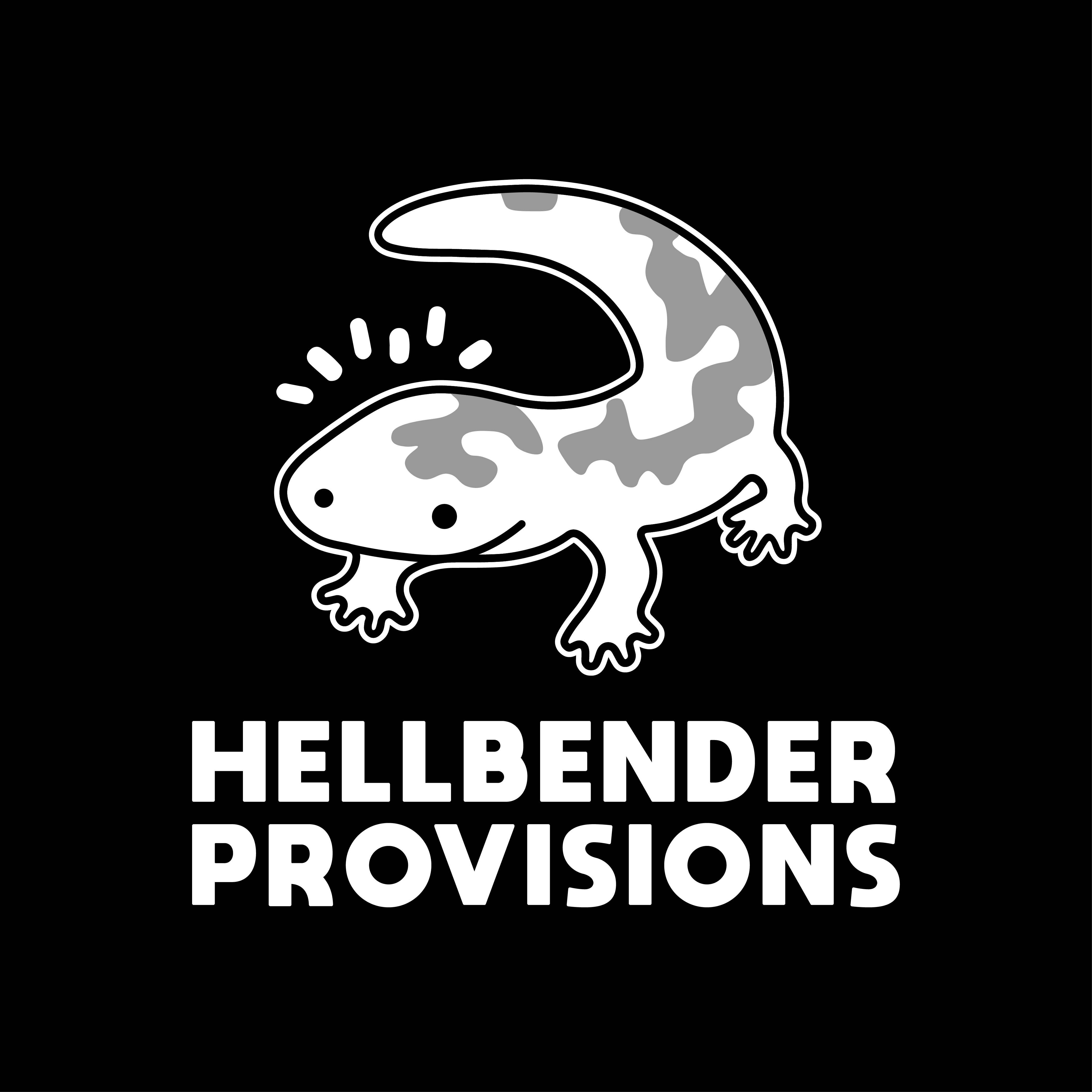
In monochrome
The same character and lockup, with a consistent outline in black and white.
View full size ↗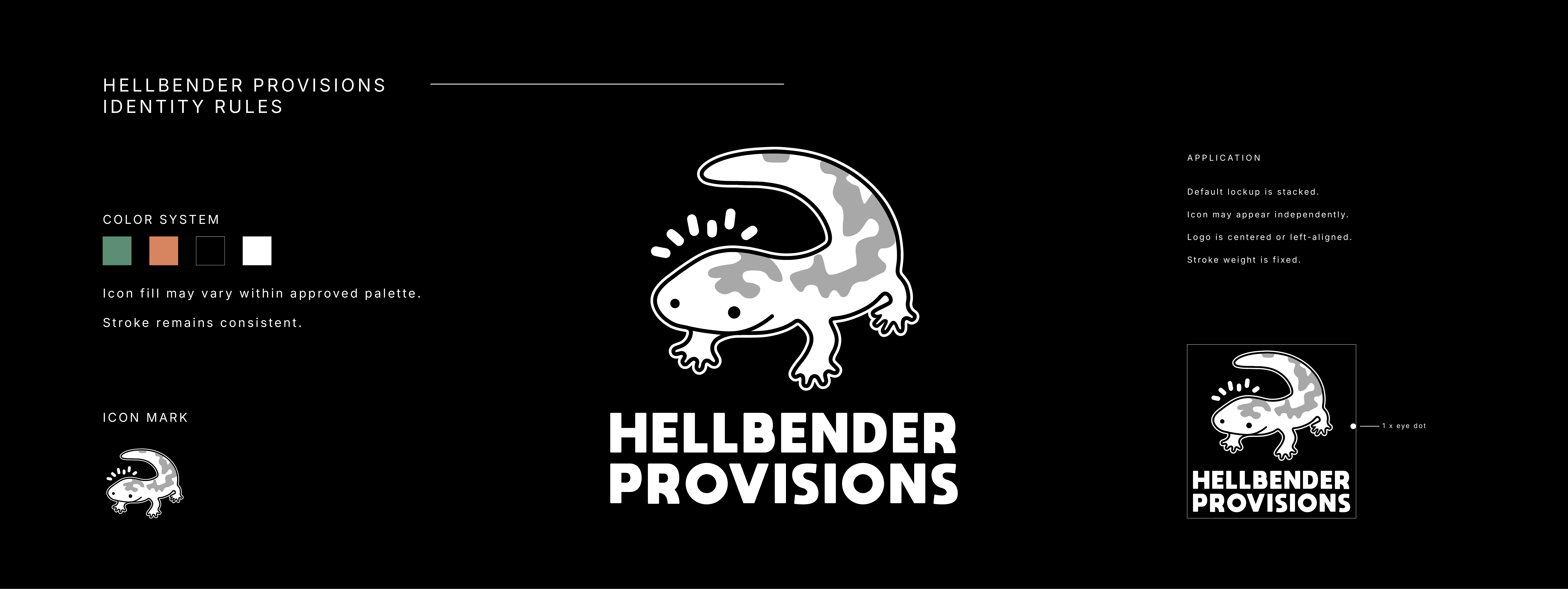
A consistent system
The stacked lockup is the default; the icon can also stand alone. Palette, stroke weight, alignment, and clear space keep the identity consistent.
View full size ↗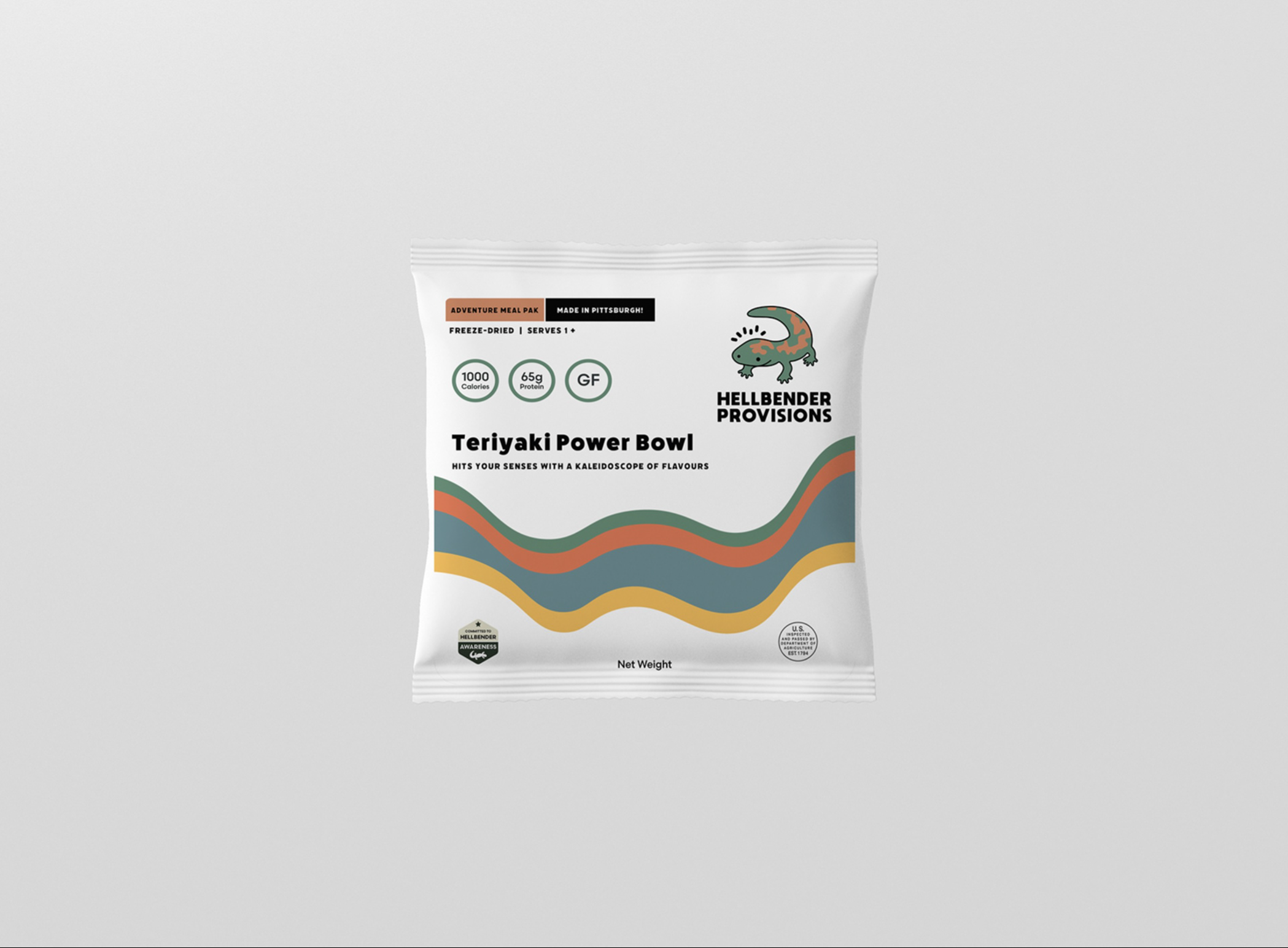
An alternate direction
A second packaging study brings the palette into flowing bands of color.
View full size ↗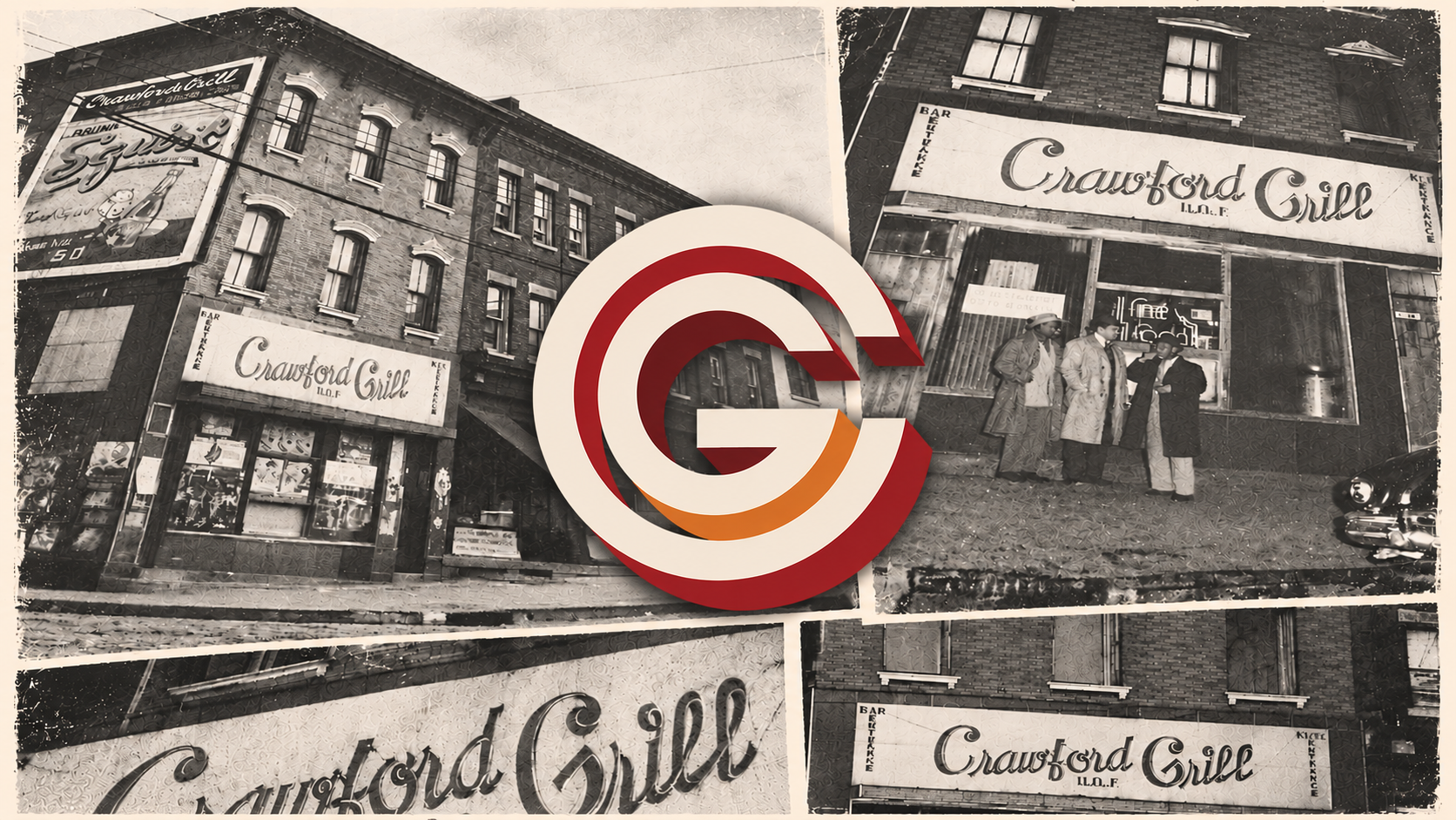
The setting
The CG mark sits alongside the building, signage, and visual character of Crawford Grill.
View full size ↗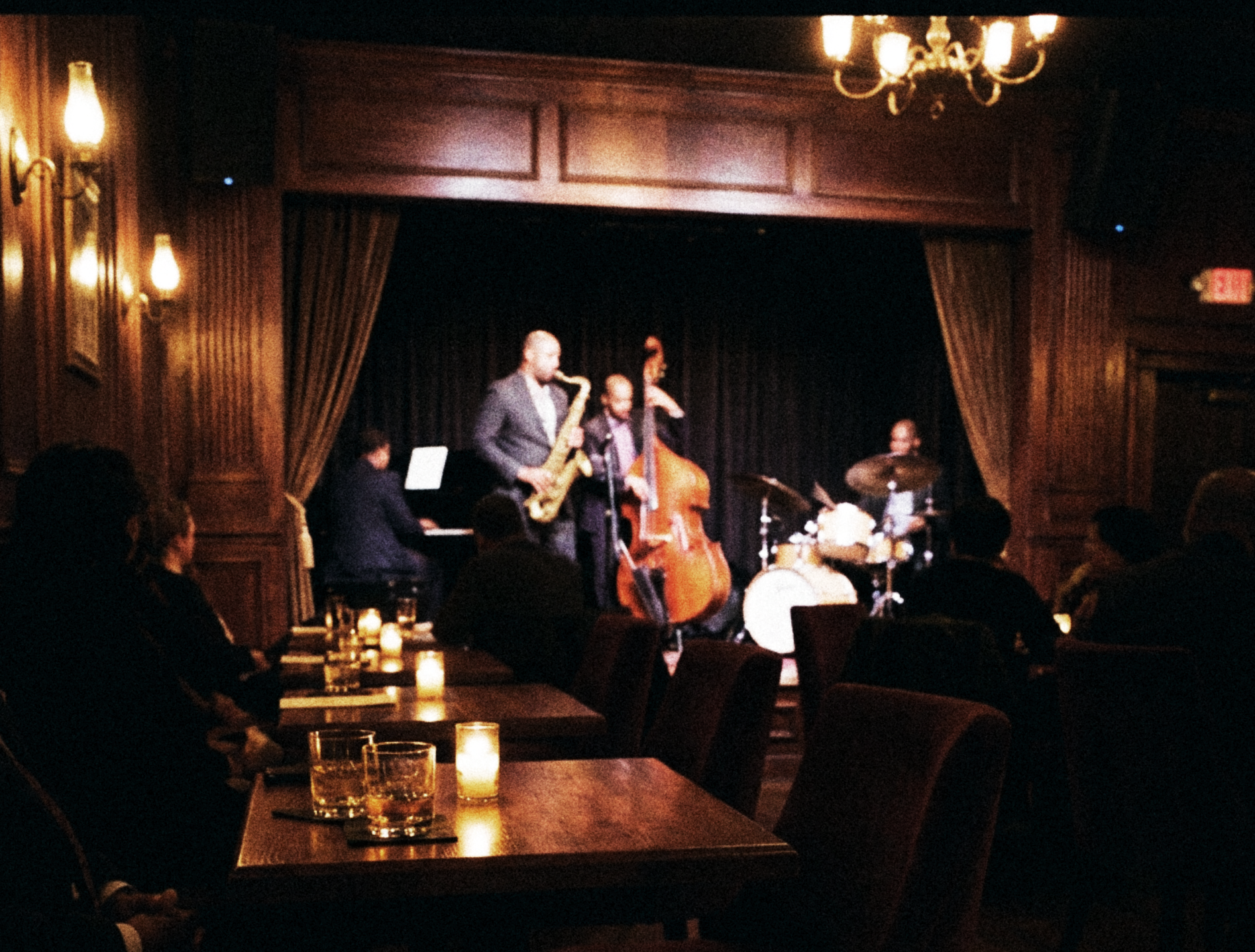
Music at the center
A warm, intimate setting provides the context for an identity shaped by jazz.
View full size ↗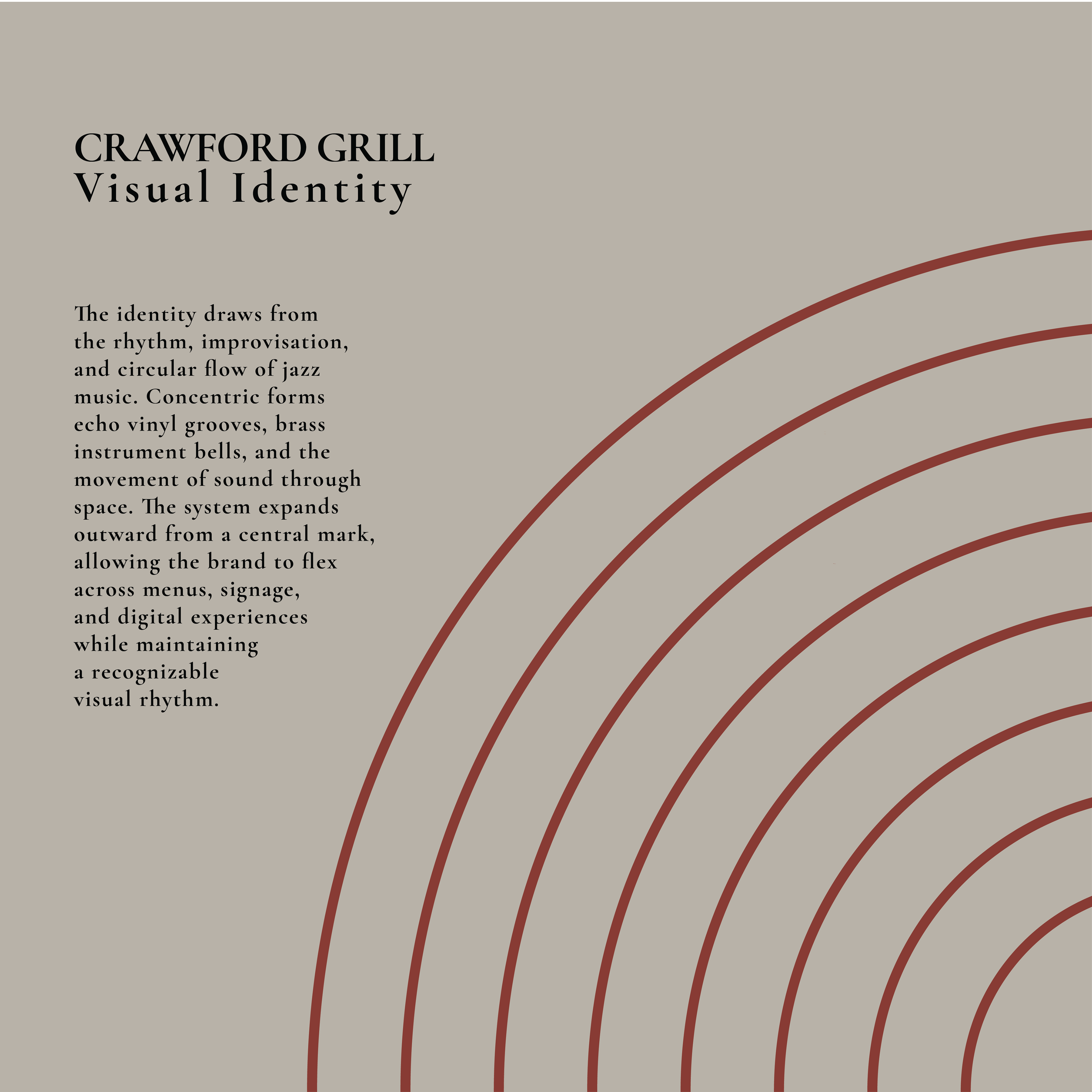
Rhythm and improvisation
Concentric forms draw on vinyl grooves, brass instrument bells, and the movement of sound.
View full size ↗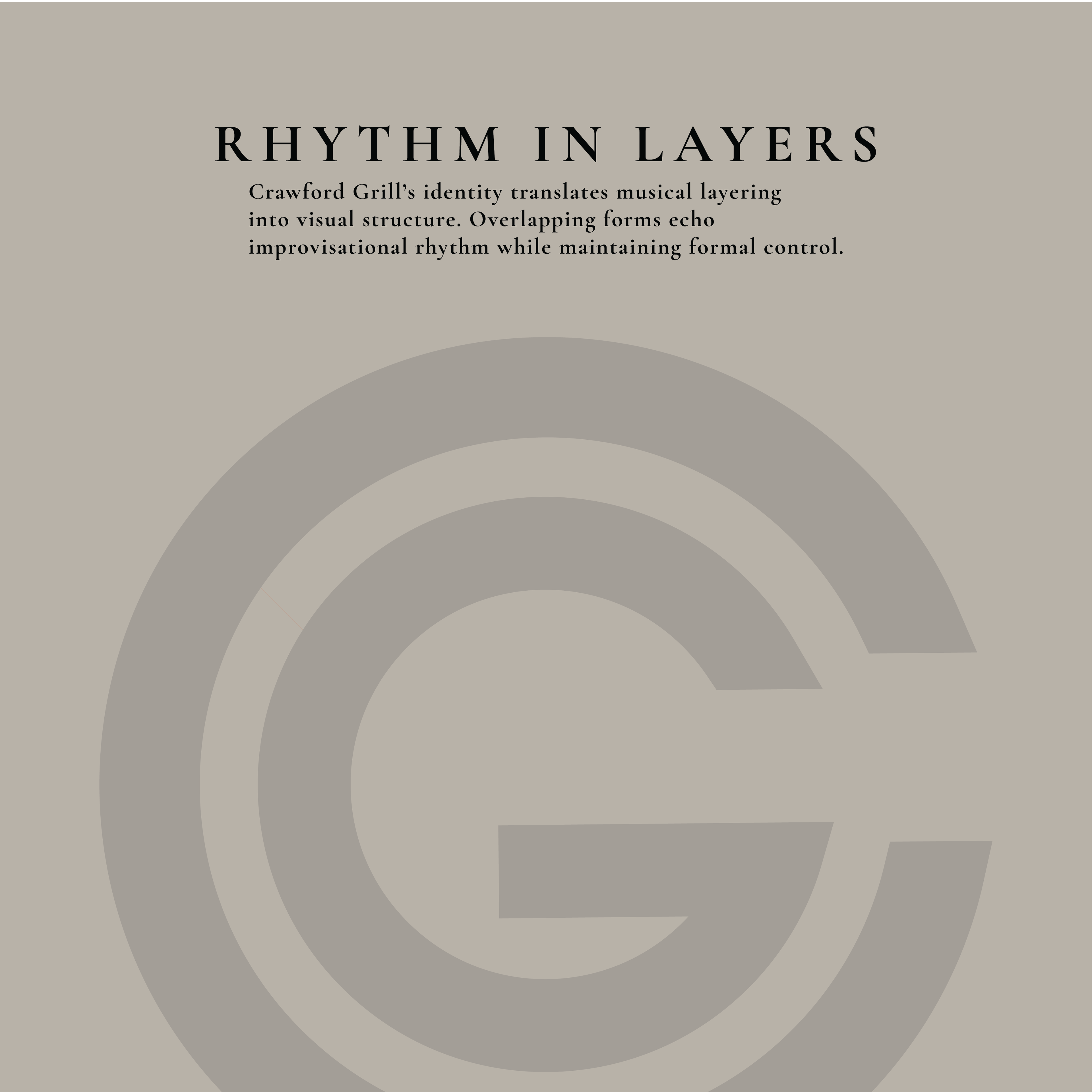
Rhythm in layers
Overlapping forms echo improvisation while maintaining a recognizable visual structure.
View full size ↗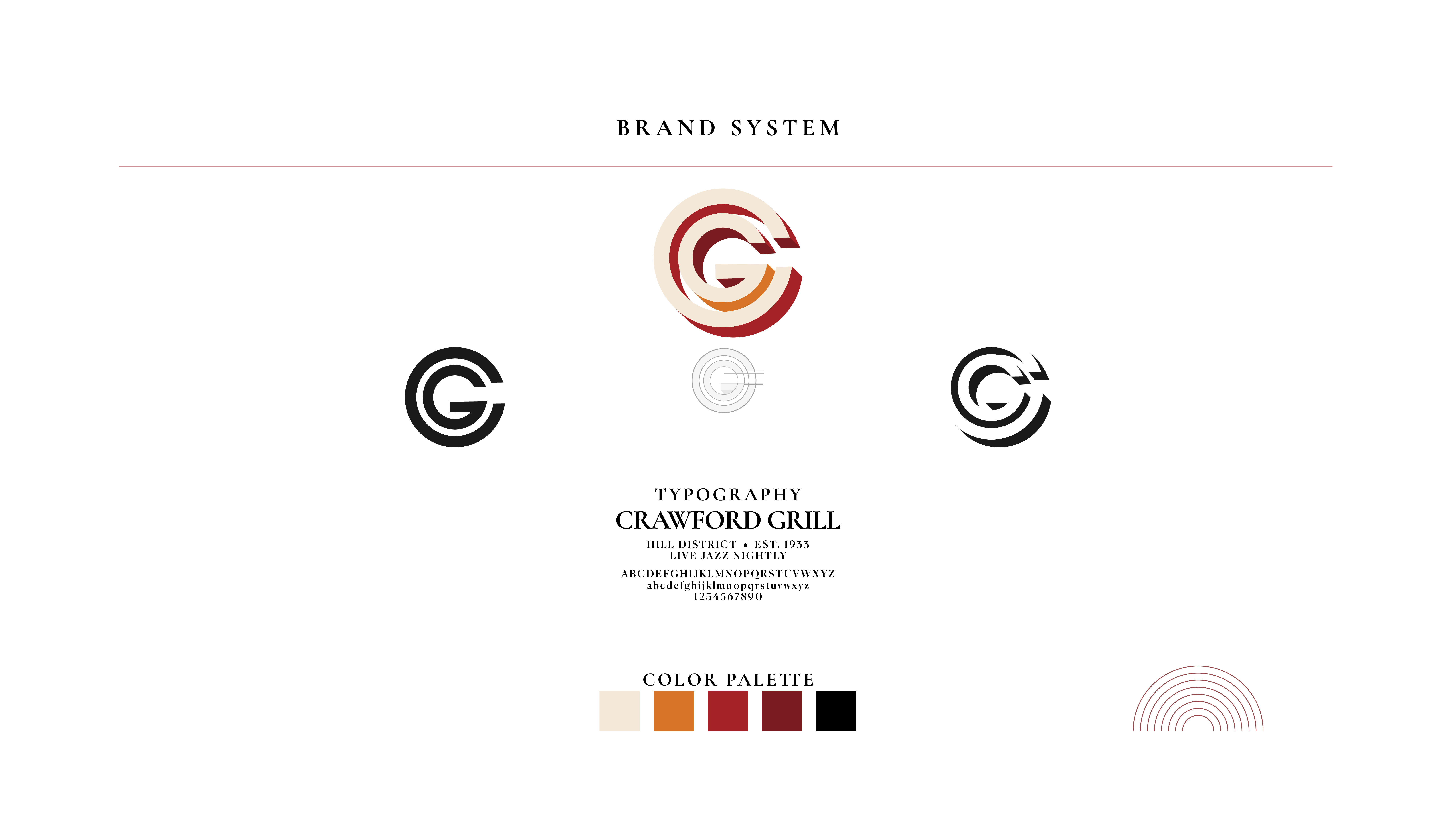
A complete visual system
The emblem, typography, palette, and concentric motif form the foundations of the identity.
View full size ↗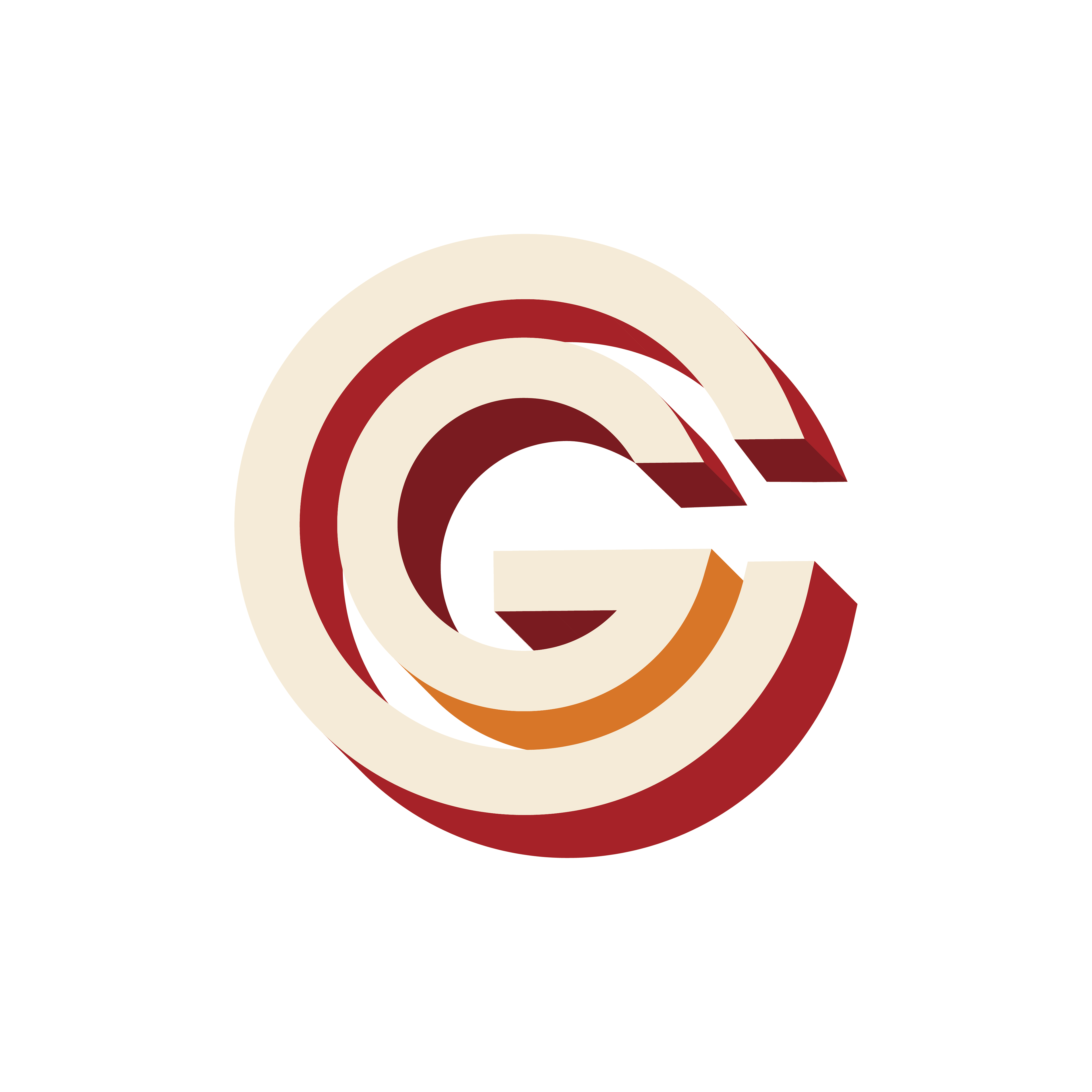
The CG mark
Layered letterforms bring the circular motif into a compact emblem.
View full size ↗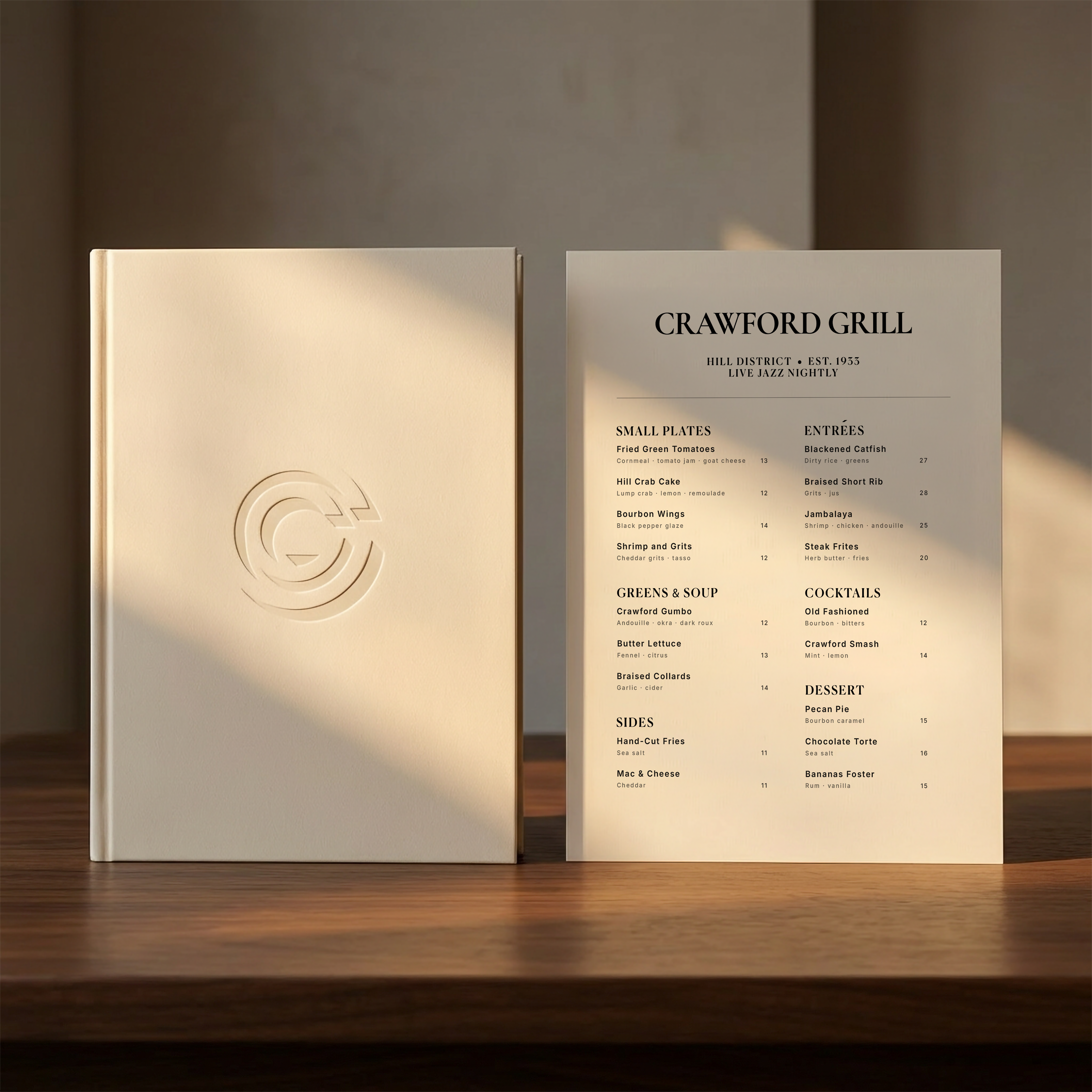
At the table
The identity takes a quieter form through an embossed mark and restrained menu typography.
View full size ↗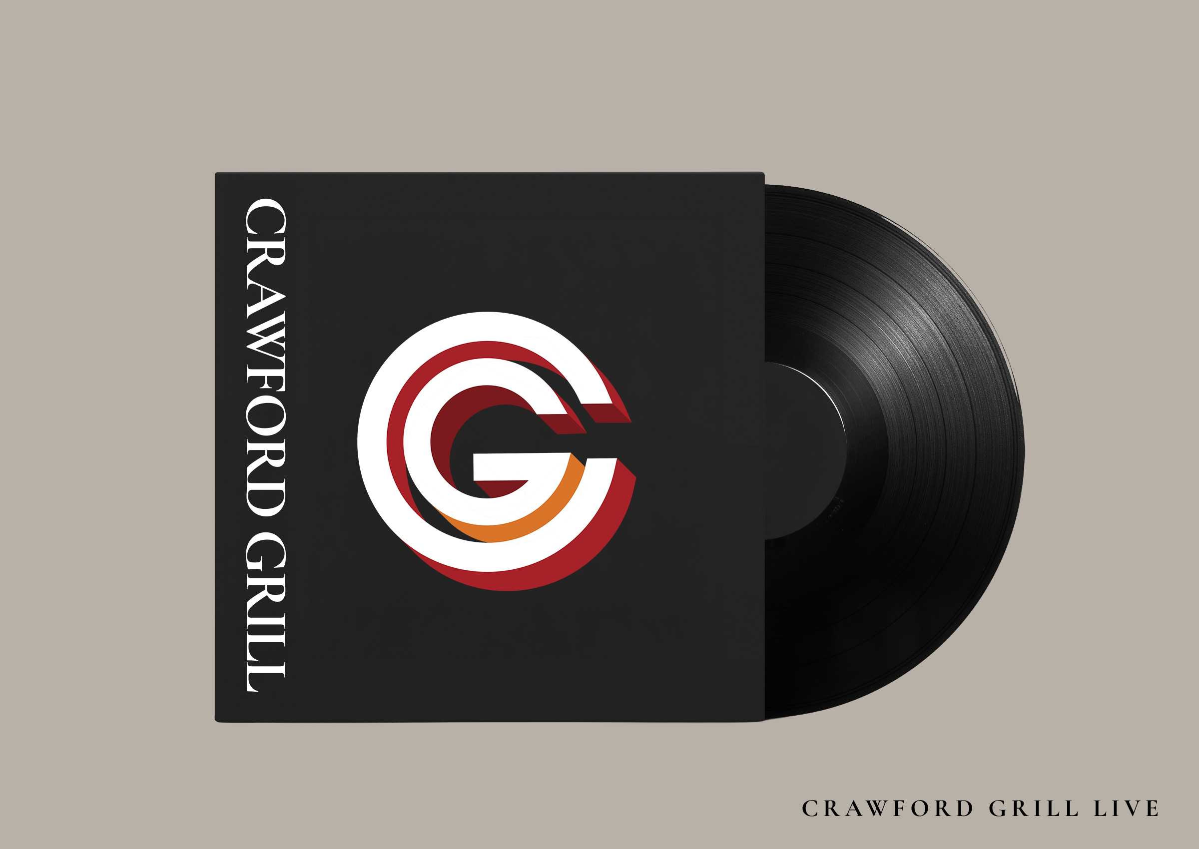
On record
The circular identity meets its musical reference on the Crawford Grill Live sleeve.
View full size ↗
An identity rooted in care
The project introduces a calm, human-centered identity for a naturopathic clinic.
View full size ↗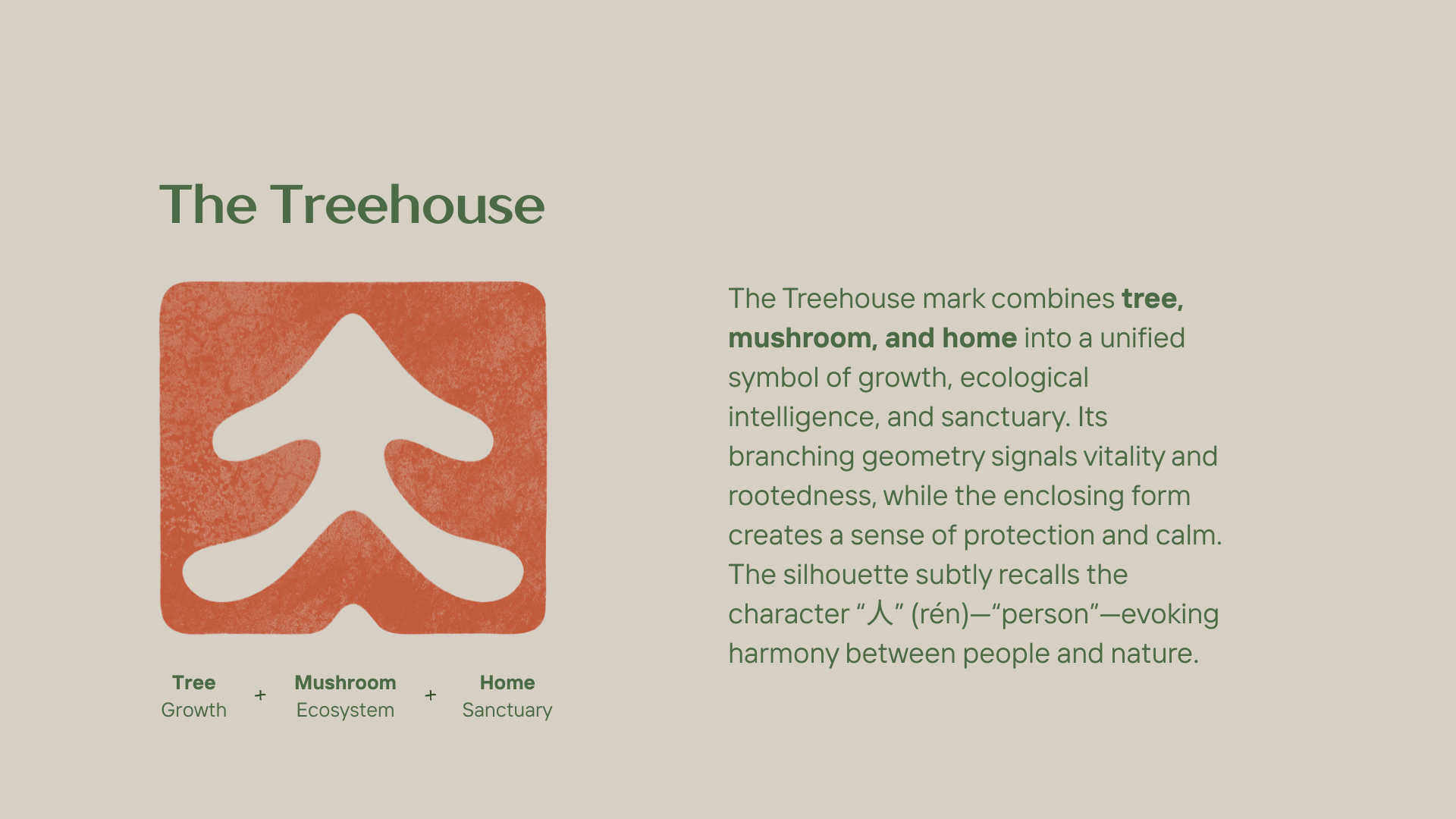
The Treehouse
Tree, mushroom, and home meet in one symbol of growth, connection, and sanctuary.
View full size ↗
Natural character
Texture and botanical details bring warmth to the geometric mark.
View full size ↗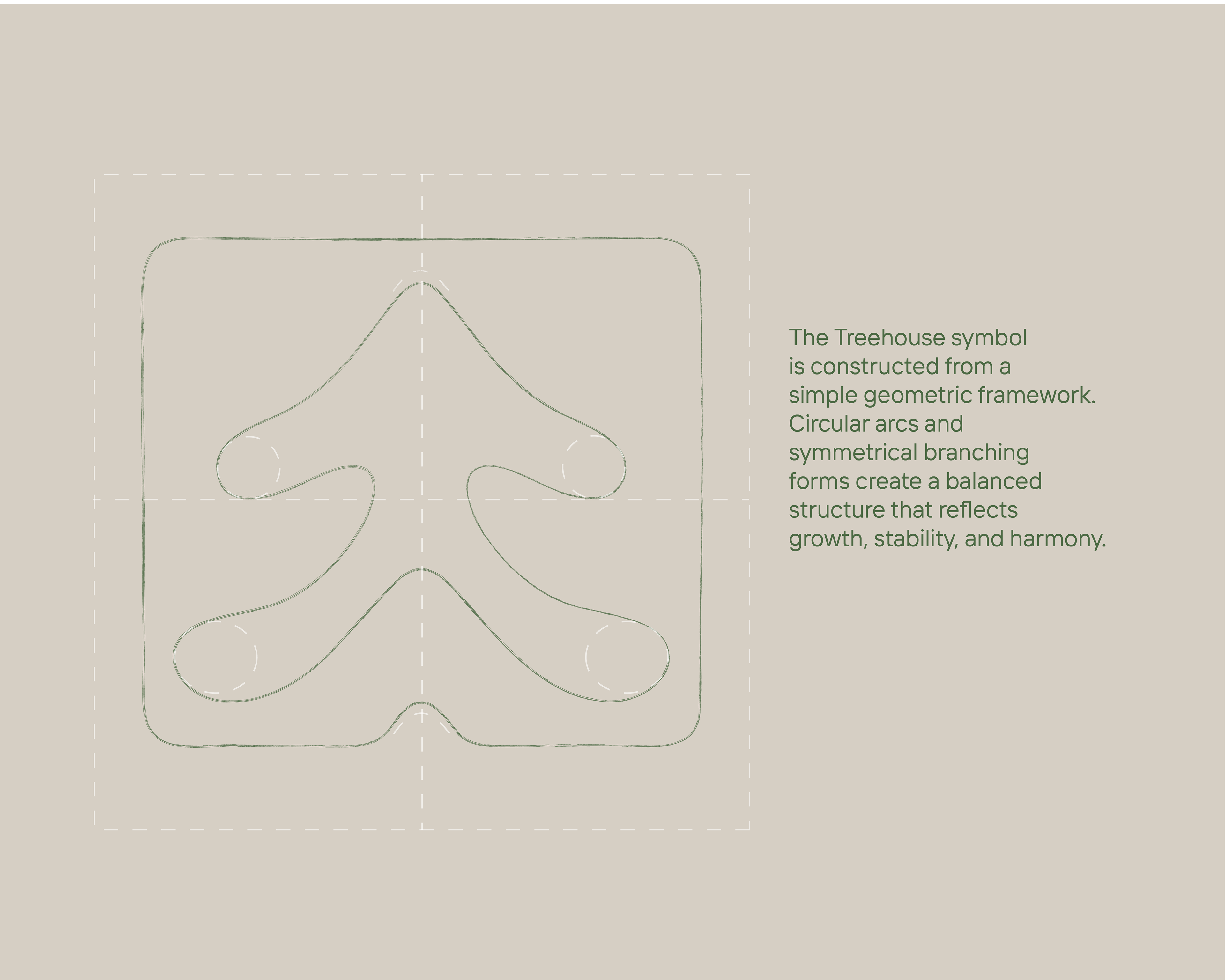
A balanced framework
Circular arcs and symmetrical branches give the symbol a balanced structure.
View full size ↗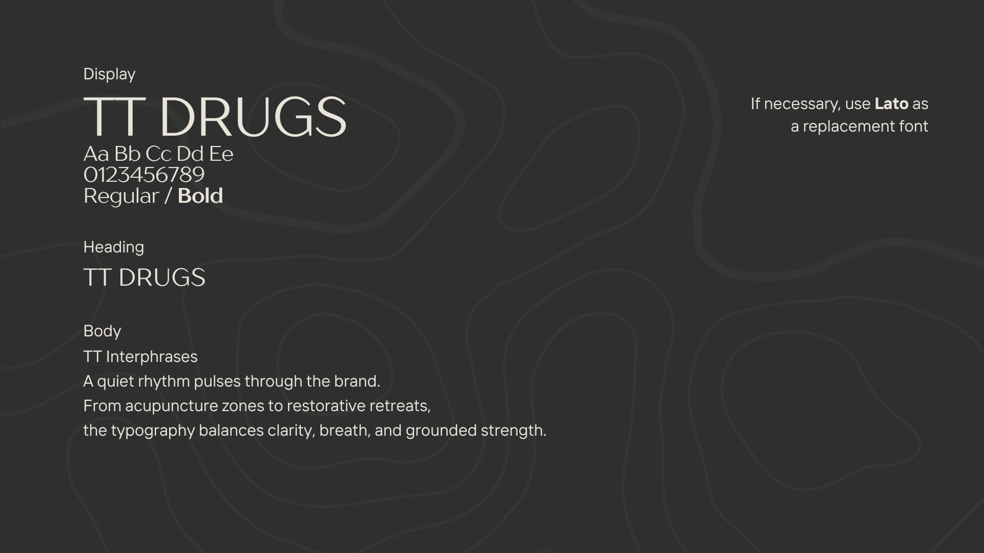
A quiet typographic rhythm
The type system balances clarity, breath, and grounded strength.
View full size ↗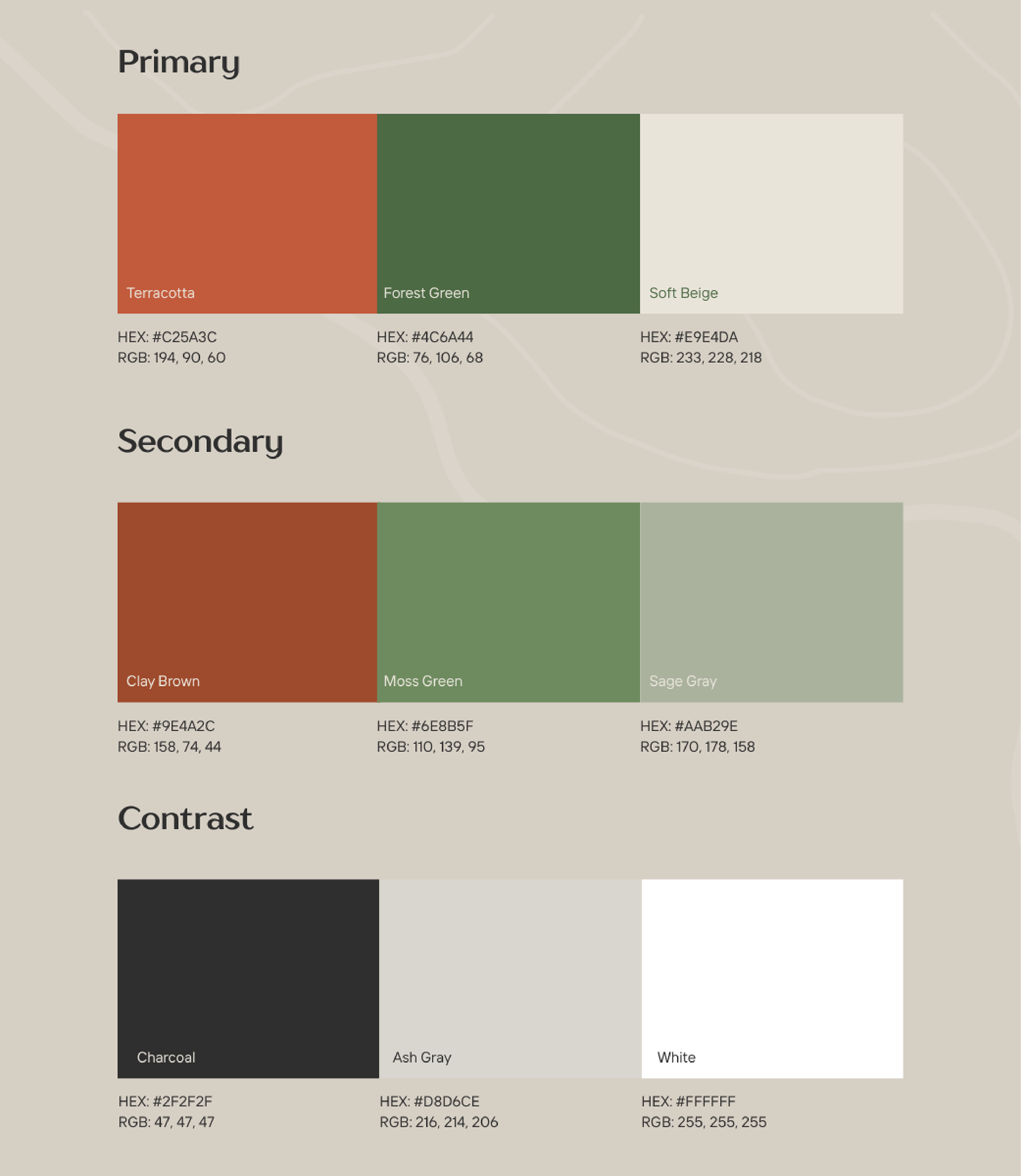
An earthy palette
Warm earth tones and greens connect the identity to its natural references.
View full size ↗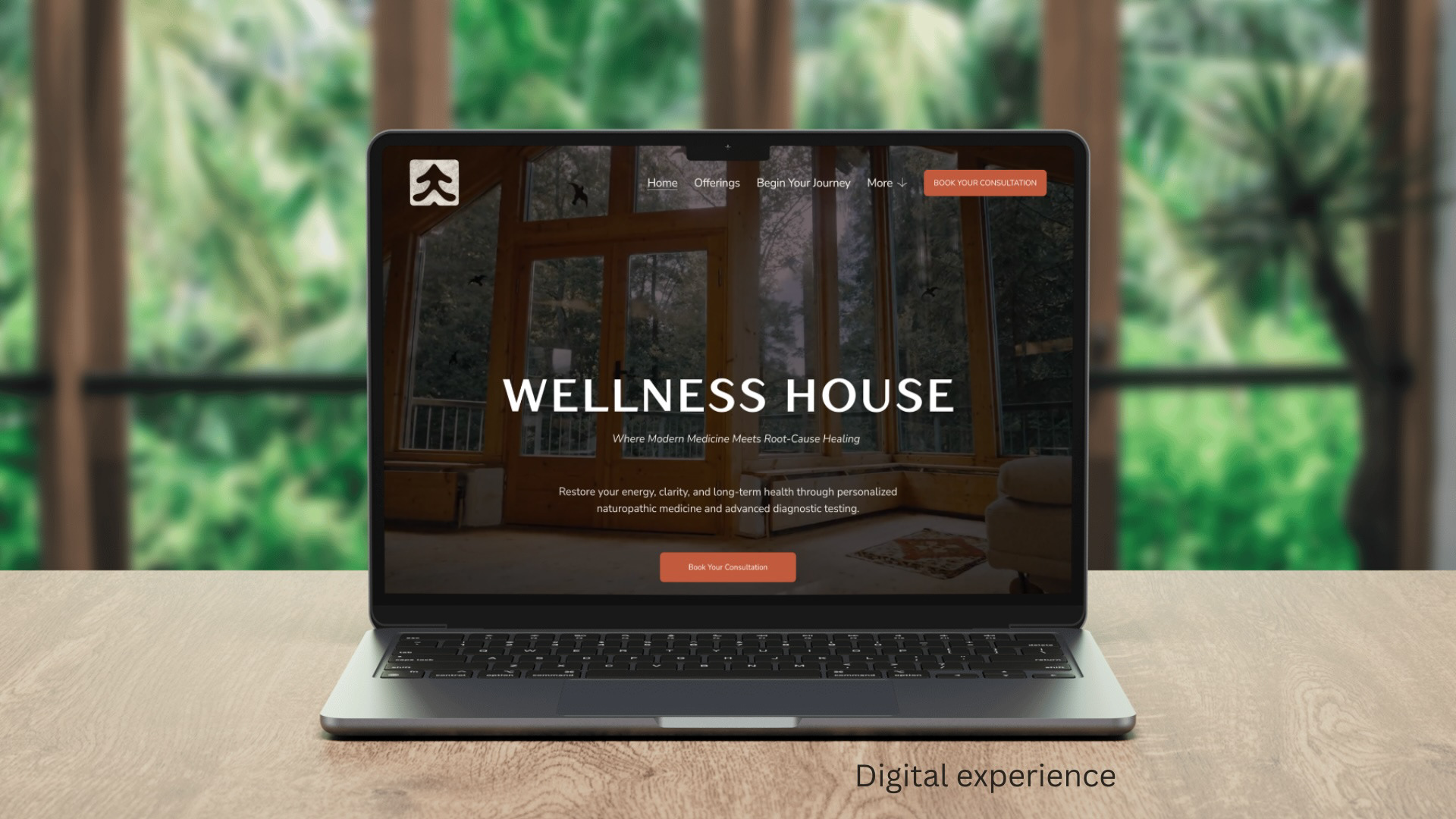
The digital experience
The identity carries into a digital setting with warm materials and natural imagery.
View full size ↗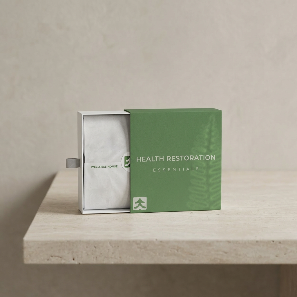
Health Restoration
The green packaging application brings the mark and subtle botanical detail together.
View full size ↗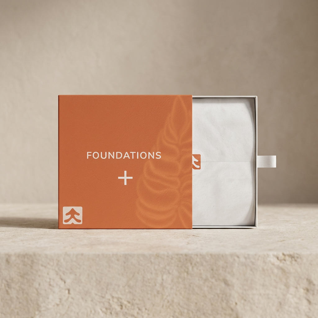
Foundations
A terracotta variation extends the same visual language across the packaging.
View full size ↗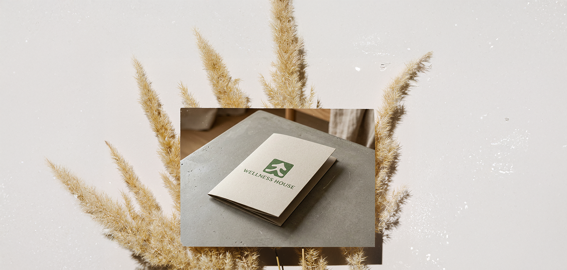
A tangible identity
The identity translates to printed materials with a restrained mark and earthy finish.
View full size ↗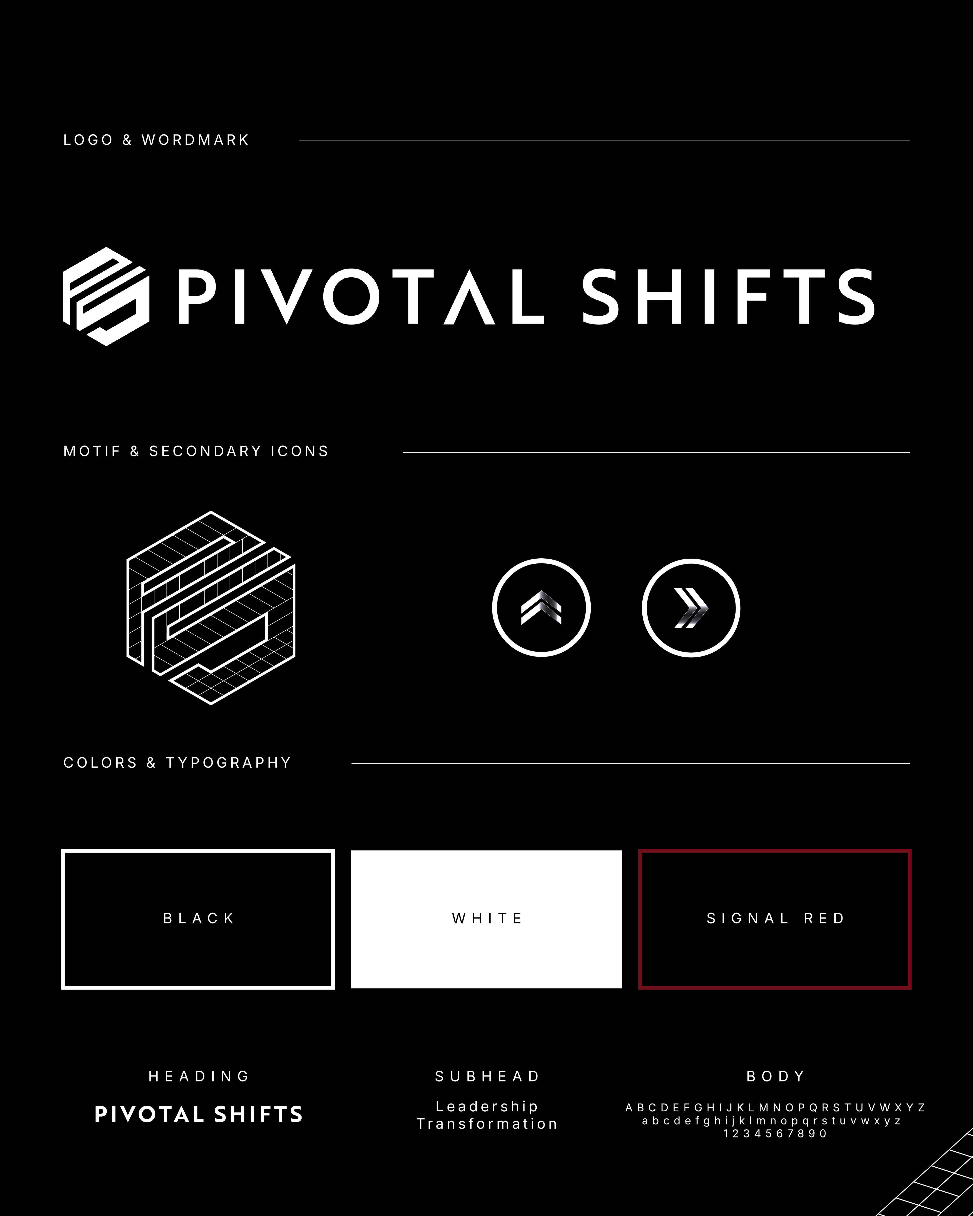
The identity system
A geometric monogram anchors the wordmark, secondary symbols, typography, and restrained palette.
View full size ↗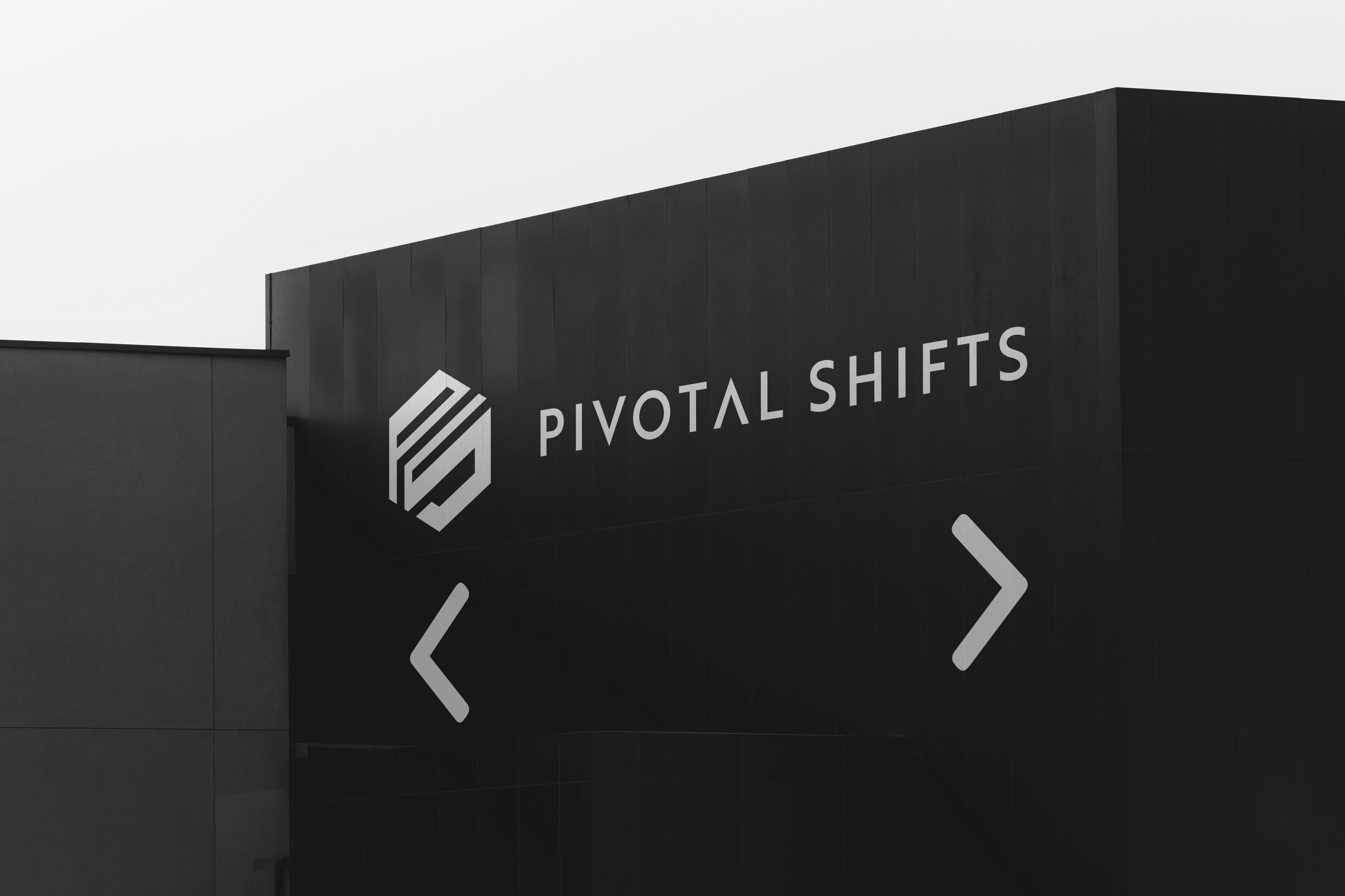
A clear direction
The high-contrast identity extends into architectural signage and wayfinding.
View full size ↗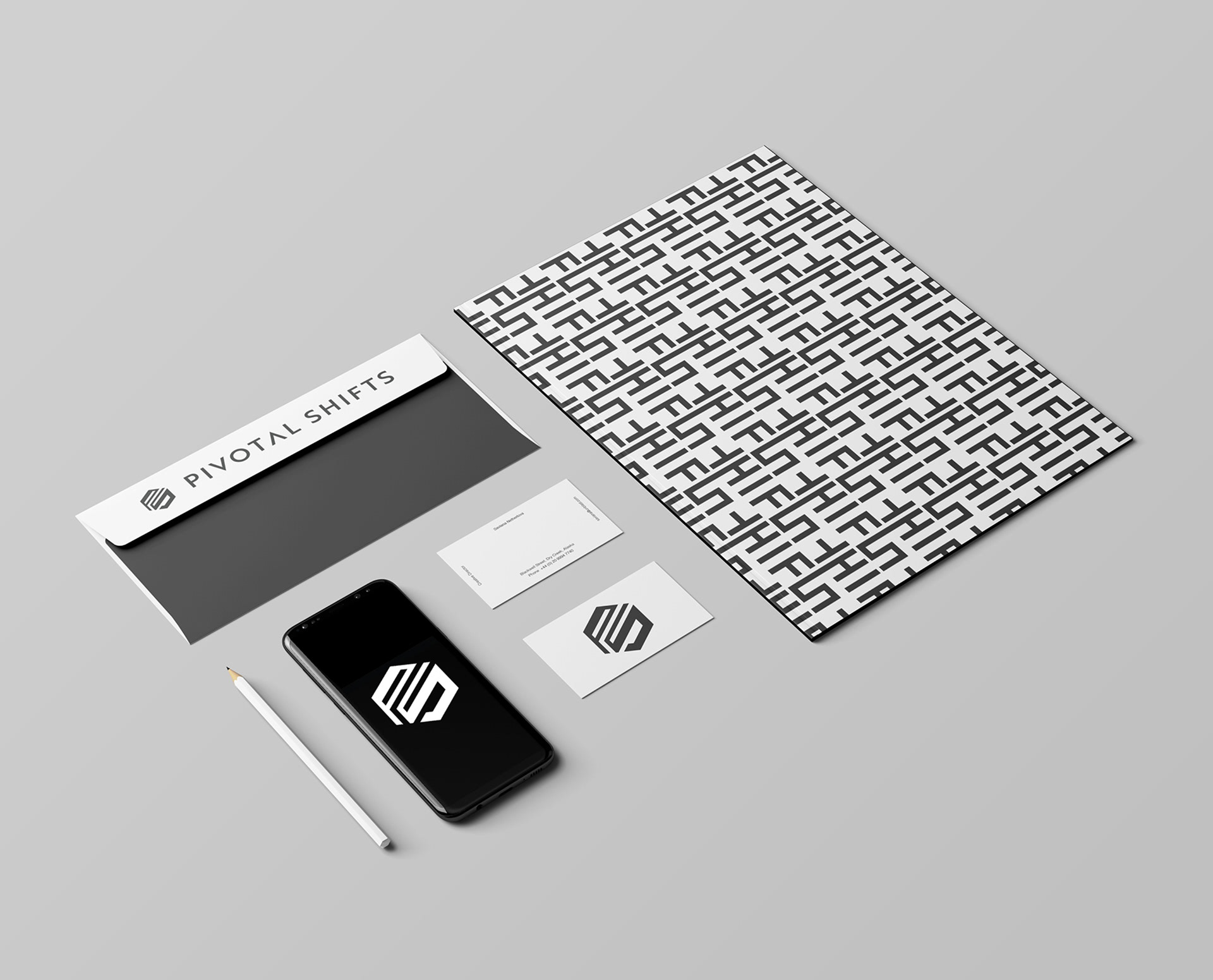
A repeatable language
The monogram becomes a repeat pattern across printed and digital materials.
View full size ↗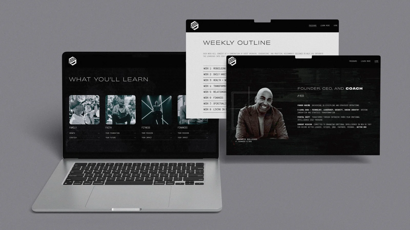
The digital experience
A monochrome digital system gives the content a consistent visual frame.
View full size ↗
Built on a grid
The monogram takes shape through its geometric construction.

A shift in dimension
A dimensional exploration of the same interlocking form.
A framework for the brand
The playbook brings the identity into a repeatable visual system.
View full size ↗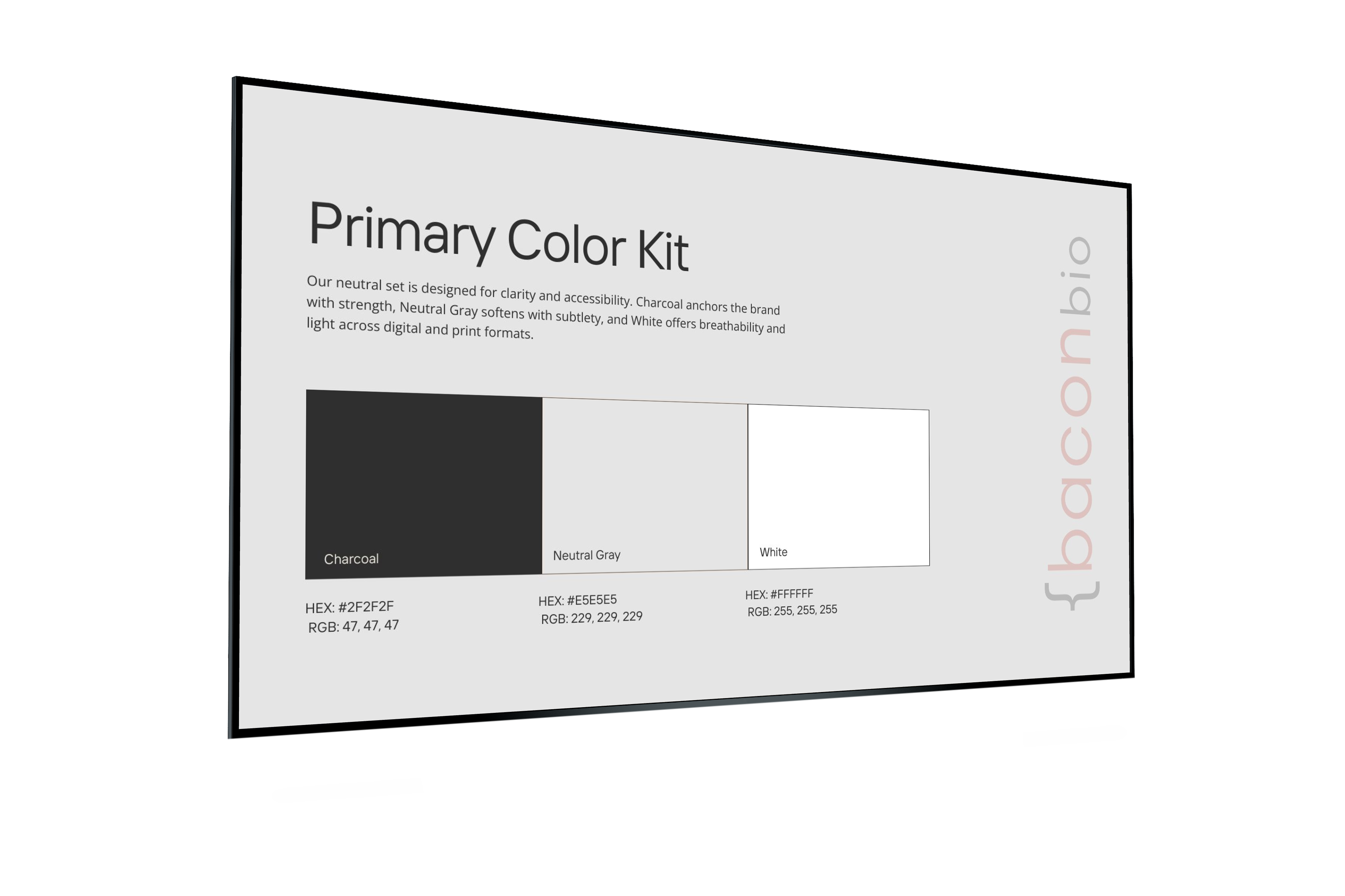
A neutral foundation
Charcoal, neutral grey, and white provide a restrained foundation.
View full size ↗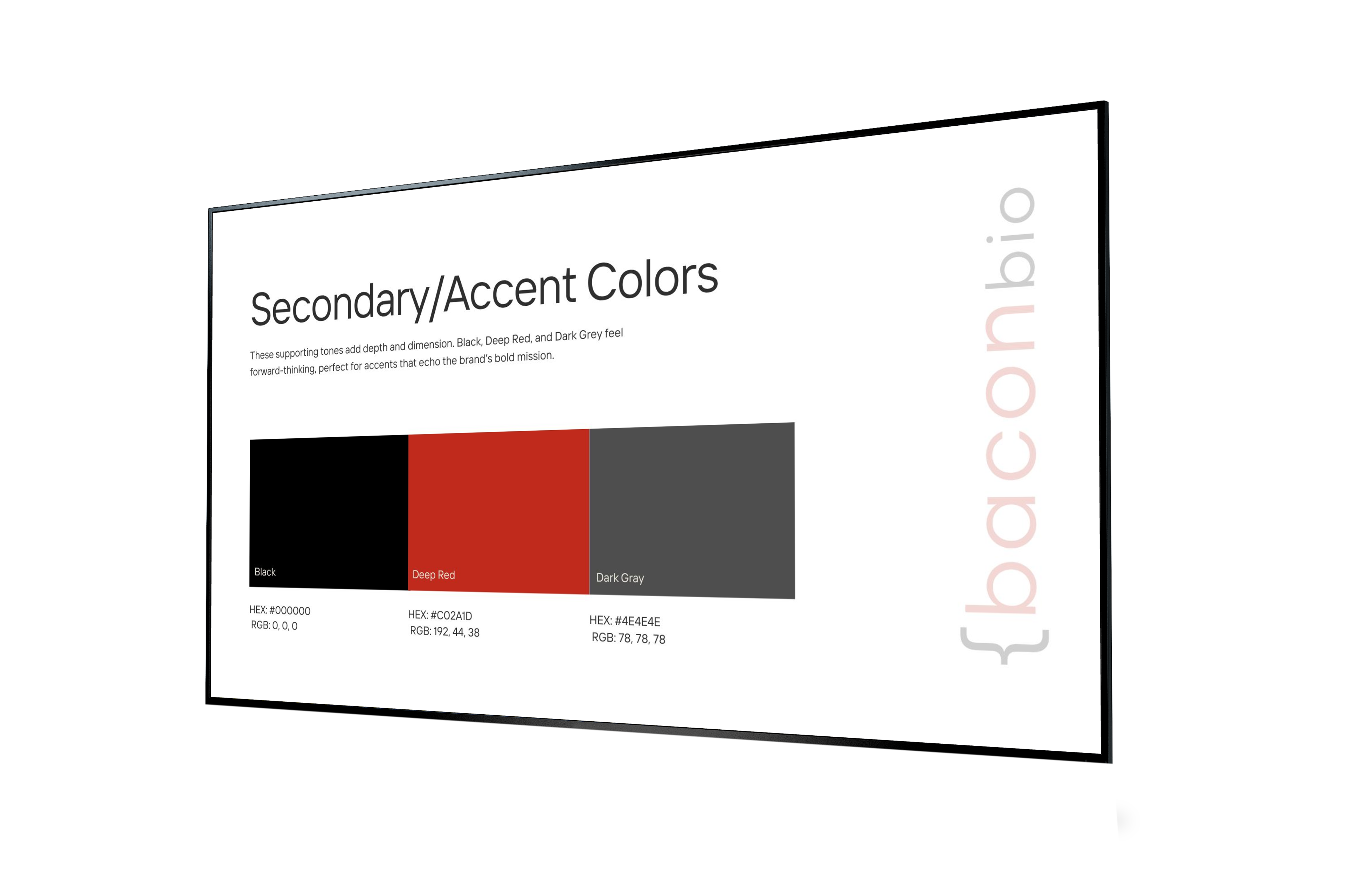
A focused red accent
A clear red accent gives the otherwise neutral system a distinctive point of emphasis.
View full size ↗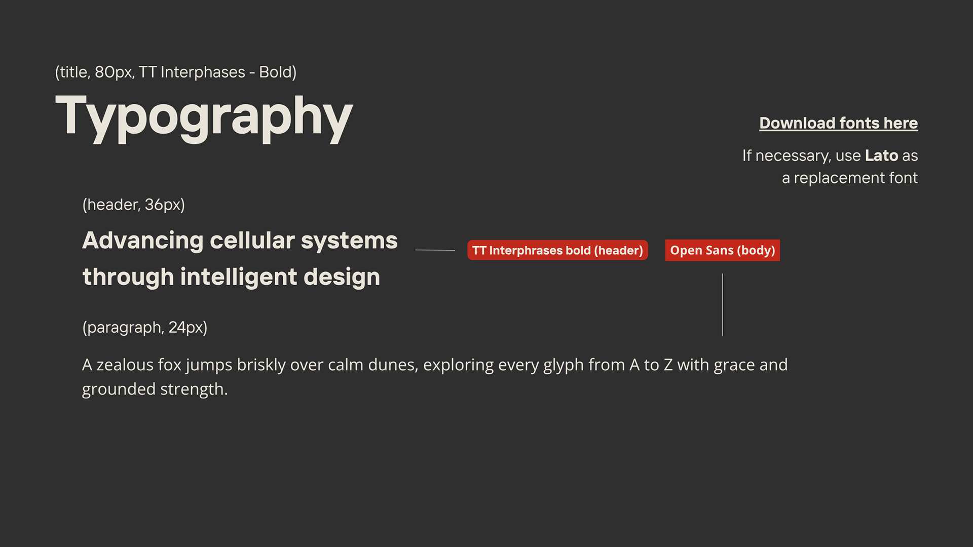
Clear, structured typography
The typography pairs strong headings with clear body text.
View full size ↗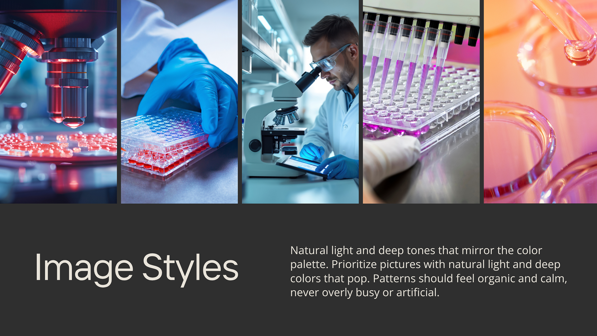
A scientific visual language
The imagery direction favors natural light, deep tones, and organic patterns.
View full size ↗
A compact signature
The brace and initial form a compact signature for smaller applications.
View full size ↗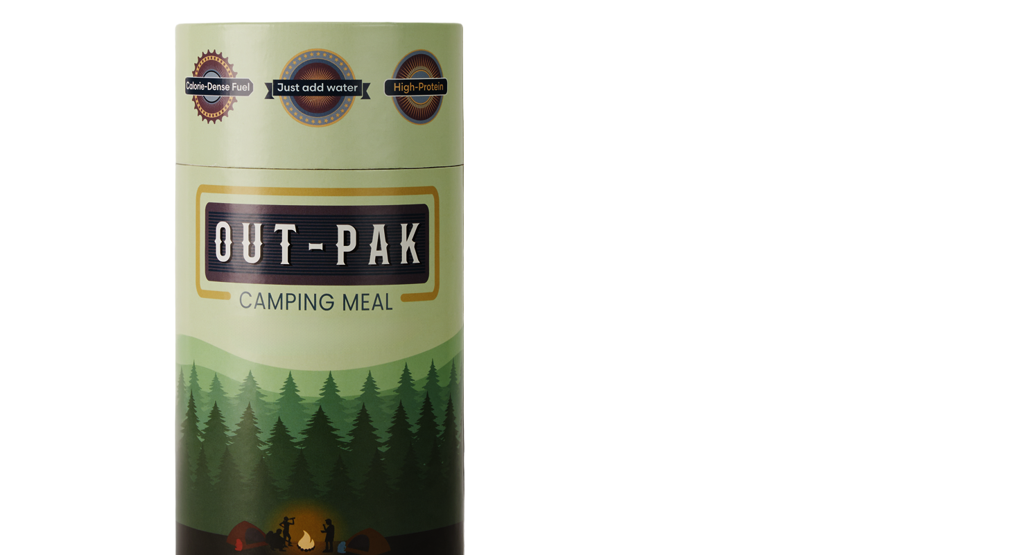
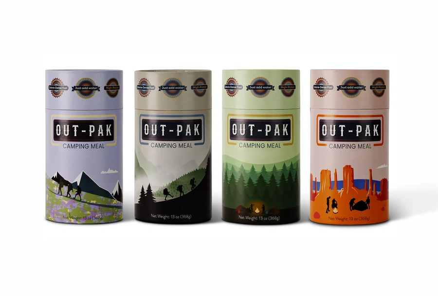
Illustrated for the outdoors
Landscape illustration wraps around the cylindrical format, connecting the packaging to the outdoors.
View full size ↗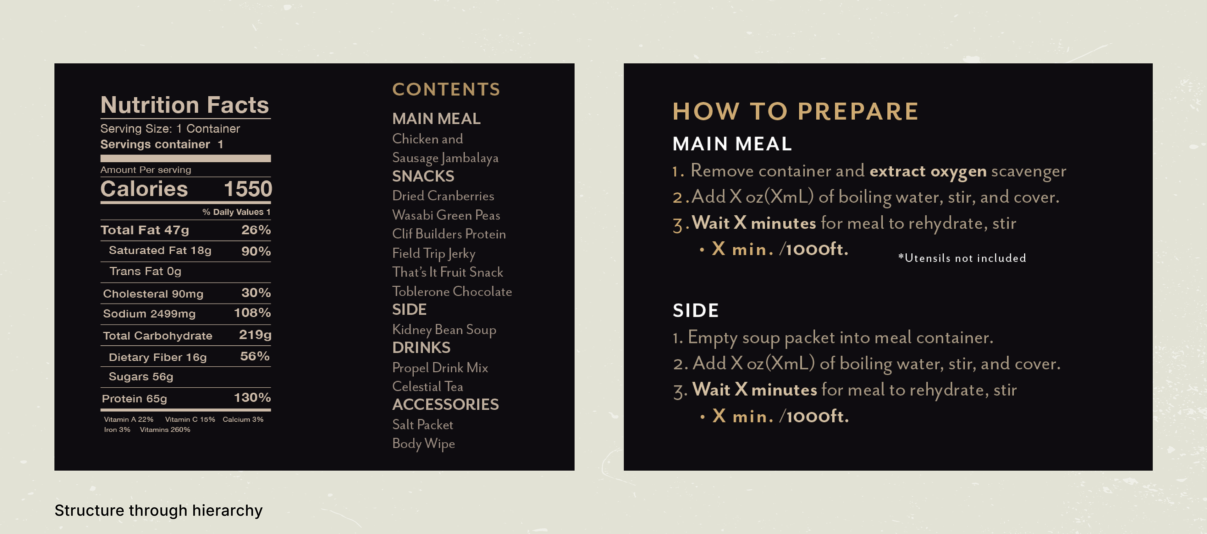
A clear information system
Dark panels bring nutrition, contents, and preparation instructions into a clear hierarchy.
View full size ↗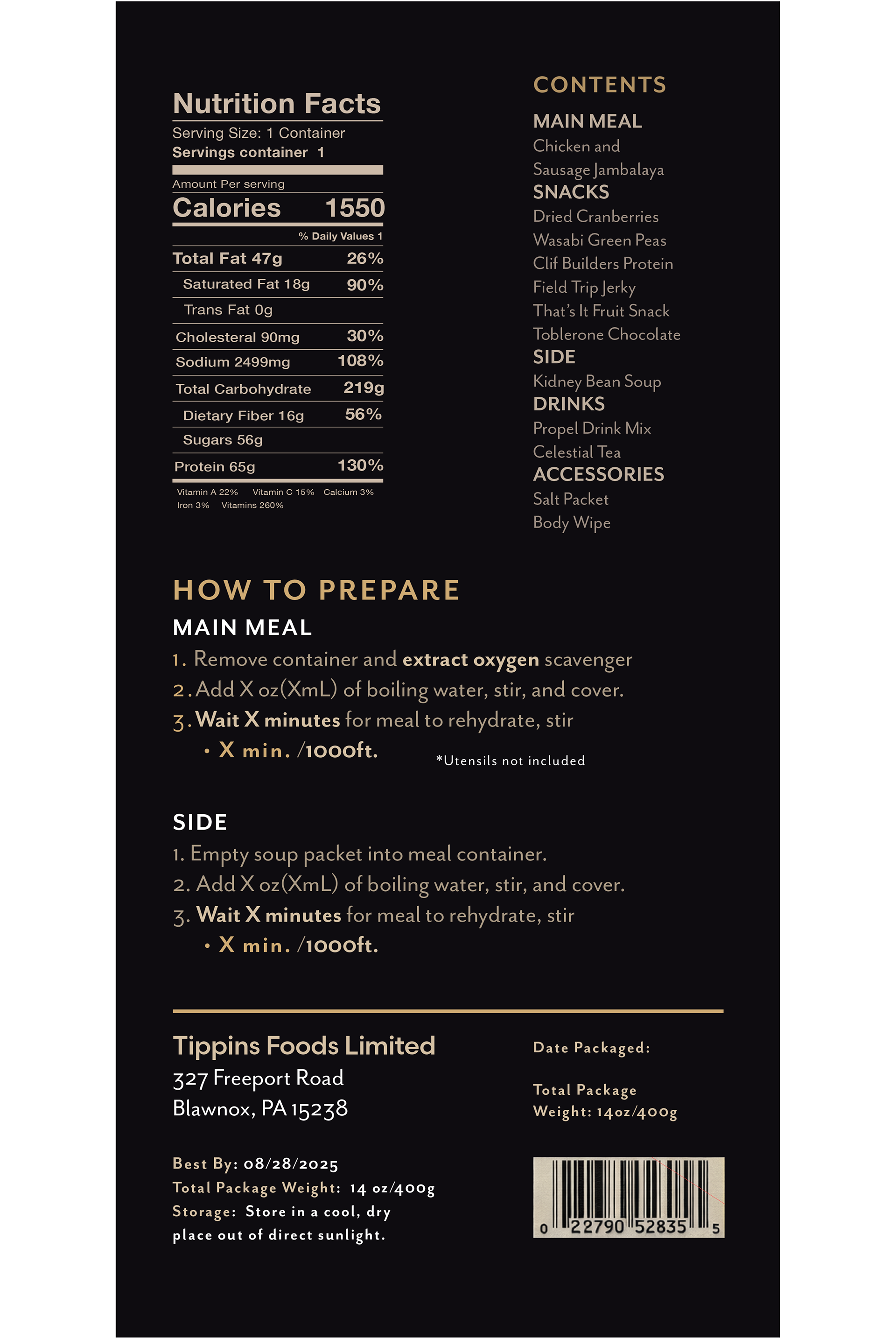
The back label
The back label carries the information system into a compact vertical format.
View full size ↗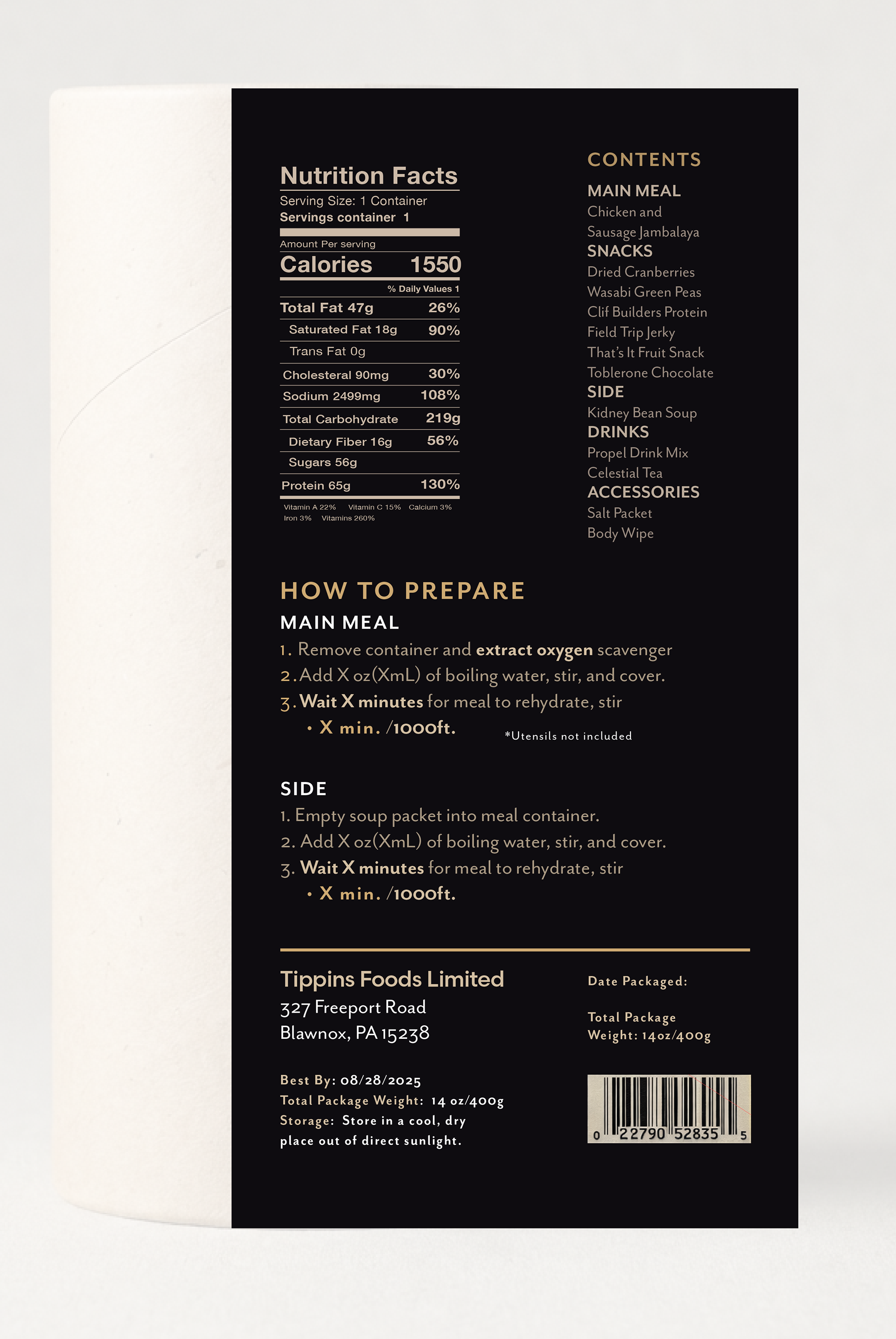
Applied to the pack
The applied label shows how the information sits on the finished package form.
View full size ↗